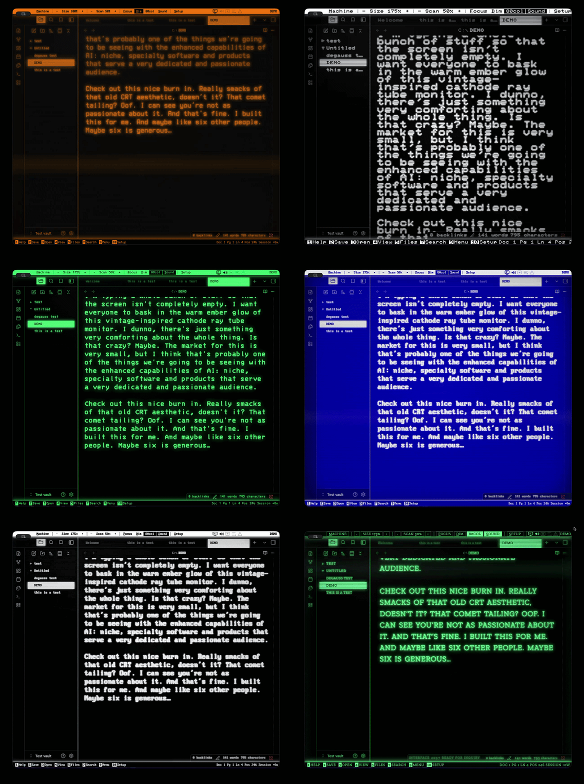
Phosphor: CRT Emulator Terminal for Writers
EDGE-CASE
A note-taking app rebuilt as nineteen historical computer terminals with researched display behavior, embedded period typefaces, synthesized hardware sound, and a DOS interface layer. What began with a search for a stripped-back, distraction-free writing environment ended as a packaged theme with a companion plugin.
Direction, references, and testing: Uri Weiss.
Implementation: Claude.
01: BRIEF
I had a really warm and persistent memory of writing on my grandfather’s word processor on an amber-on-black CRT monitor when I was a kid.
We’ve got some great benefits as technology’s advanced, but we’ve also got a ton of distraction.
I try and do a lot of writing. Being on this AI kick, I wanted to try and build an homage to those old school CRTs and word processors while also giving myself a way to minimize distraction and focus on essentials when writing.
02: HOW IT WAS MADE
I found that Obsidian’s features like character mapping and deep-linking were a fantastic tool and, being open source, provided a great foundation to build themes and additional features upon.
It’s a good division of labor. AI will implement what you describe. It’ll do a pretty quick, competent job. But it can’t see the screen, doesn’t know when something has some subtle flaws, and will rebuild the same wrong idea—just with better technique until you tell it the idea’s wrong.
I’d send screen captures with note for updates like jagged edges, wandering cursors, settings panels crushed into unreadable columns. Sometimes visuals would be faster, so use pictures and GIFs of bad animation with fixes described.
Some features were hokey and I decided to scrap them. Simulated monitor bezel, barrel-distortion effect, an animated cursor for MU/TH/UR 6000 just wouldn’t work correctly.
Testing was as simple as doing what I normally do in my spare time. I just used the program to write and saw what held up in testing, what would be interesting to try and add: typewriter scroll, focus mode, scanlines tuned to a default setting to balance legibility with retro aesthetics.
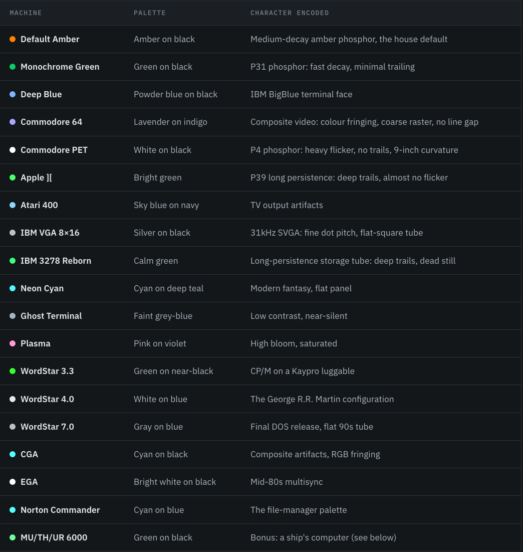
03: MACHINES MENU
Instead of inventing color schemes and font combinations, I figured the real things were better than good enough. Cool-Retro-Term offered a great starting point, but its functionality was intentionally limited to provide users with a terminal emulation.
(Pictured)
04: PHOSPHOR DETAILS
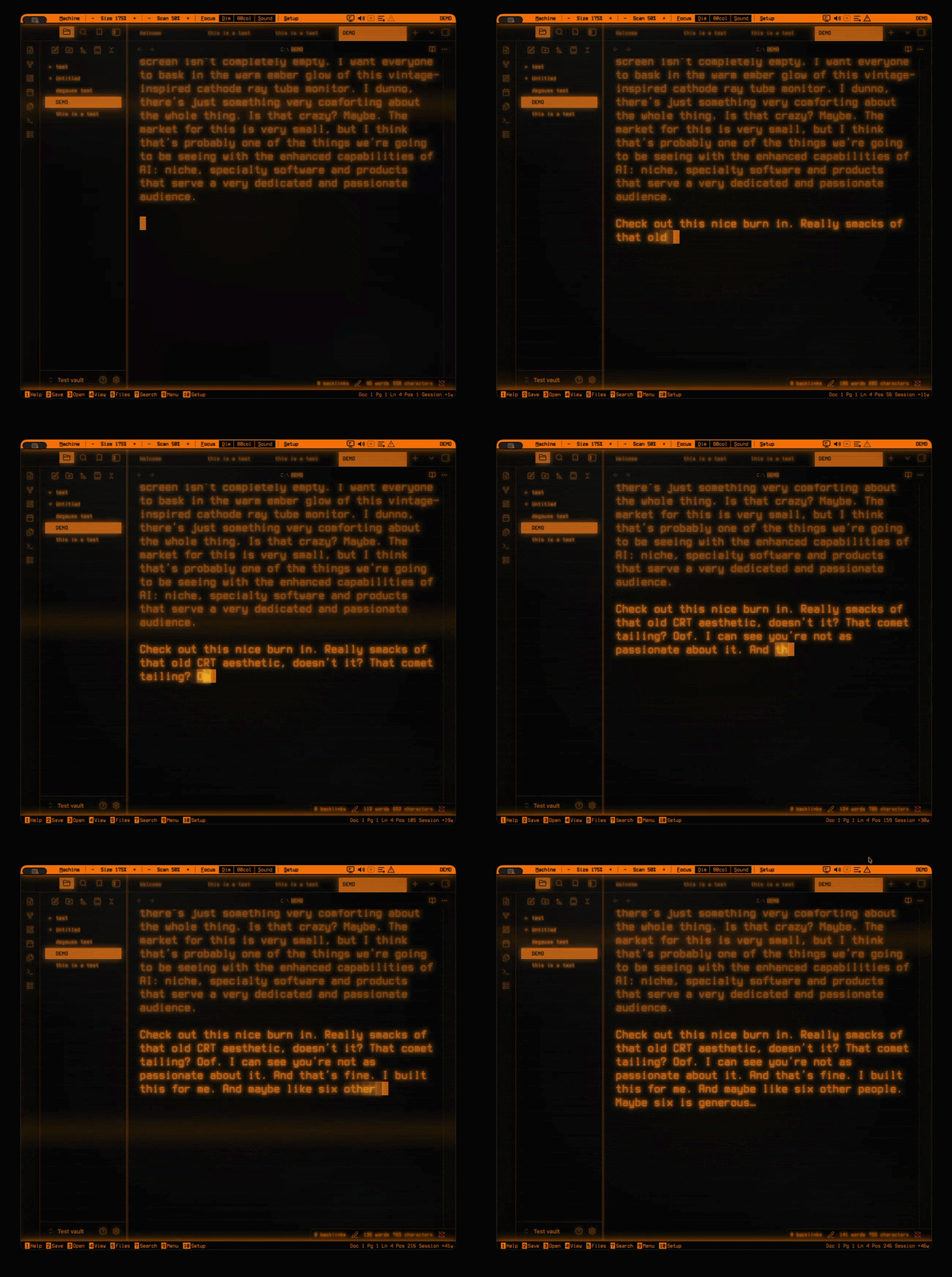
There’s plenty of documentation about CRTs. Apparently there’s a large community of enthusiasts. That meant plenty of documentation to draw on for the finer details that would make this project more realistic. Realistic color schemes and layout was a good start. Realistic behavior would be event better.
(You can see this in the video below)
05: FONTS
Terminess, Departure Mono, BigBlue Terminal, PetMe and PetMe64, PrintChar21, Atari Classic, PxPlus IBM VGA, IBM 3270, Iosevka, JetBrains Mono and Fira Code, plus four slab serifs added for the Nostromo profile.
These were complimented by adjustable settings like pixel-perfect scaling, font width and tracking, text size presets, and all uppercase to applicable machines.
06: FURNITURE
There were other features I wanted to add that would provide additional utility, integrated in the terminal aesthetic. Focus Mode blacks out the monitor the window is in and floats the terminal in the middle of it, with drag-resizable edges and corners (width and height independent) while not impacting other monitors.
Typewriter Scroll locks the active line to the middle of the screen to further enhance focus. Line Dimming fades every line except the one being written. More focus.
Session Word Count helps you track your productivity with an at-a-glance update of the number of words added to your manuscript across your files after launch.
Cursor options include Block or DOS Underscore, sized to the editor’s real character cell so it stays locked in proportion at any zoom. It also includes a beautiful phosphor trail behind it.